Thursday, 12 December 2013

Packing Development and Final Designs

This is the dark chocolate version of my three chocolate bar designs.

This is the white chocolate flavour of my three chocolate bar designs.
This three designs above are my Final packaging designs with all the changes I have made including an edited backing pattern. The background pattern now covers the entire packaging making the rest of the design stand out. The text works well and is readable with this new pattern along with the colours standing out a bit more. The background i feel helps create a bit of a more interesting design that is nicer to look at.

This design has been further developed to include a pattern to make it a bit less boring. The back of the packaging has also been greatly improved. The reverse now looks a bit neater and fits the packaging style a bit nicer. I feel the pattern could be a little larger though.

This is the dark chocolate flavour for my chocolate bar and the design has been made to fit the other two.

The same changes have been made to this one as they have on the white chocolate flavour however I will need to change the colour of the net weight text.

This is the semi finalised design for the white chocolate flavour bar. Overall I've fixed the sizing and made the font on the front more appropriate. I like the improvements made on this design, it works better for that elegant feel. The reverse of the packaging has been improved a bit more but there is still more to do at this stage.


This is an incomplete version of my packaging design. Its purpose was mainly for testing placement and scale. I found the bar to be a bit too wide and the branding identity to be the same.

This is a 1:1 scale version of my net with all the appropriate sizes.


After a few thumbnails, I moved back to the computer to get a better idea of what i could potentially want and i liked the concept. The bars on the middle and top of each one represent the flavour which is helped with a bit of text on a ribbon. On the top row there is gold text which provide a little description on the flavour but its a bit hard to read so i took it out.

This was my initial background idea for my three different chocolate bar packaging flavours. I decided to experiment with others things as i wasnt sure if these would be appropriate for my elegant packaging.

Friday, 4 October 2013

Branding Identity Development.


This is the continued development after i received the feedback from the pin-up. I also decided to test it against a few quick ly developed backgrounds to see how it would work with different styles.

These are the notes that were made during the pier review session.

This is the second page of logo development. I tried a few different ideas in a few different colours. This page was also the page i used in the pin-up critique session and the most favoured choice was the second in from the right on the middle row. I liked this one the most as it was contained and scalable. 
This is the first page of development. I focused on two styles of fonts, just like in my thumbnails but as you can see i quickly came to a decision for one i liked in this style. The one I liked was the last one.


This is the second page of inspirational fonts. These font consist of serif and sans-serif fonts which still shows a bit of elegance but does so in a different style to the other page. These fonts would need different techniques to make it stand out because the strokes are thinner and there is less going on with the type, for example these use straight thin edges as opposed to large swoops and curves.  I particularly like Stymie Stylus as its thin like sans-serif fonts but uses feet making it a serif font. The feet on the ends of the letters also helps with the look of elegance. I also like Belle Font Nouveau as its taller L's look nice with the smaller lower case letters.

This is the fist page of inspirational fonts i collected to give me an idea of potential logo styles I could go for.This page of font ideas consists of calligraphic fonts with emphasised curves. The elongated swoops and fancy curves make these fonts good to use in a high market product as it adds a bit more class to the design. The two fonts i like the most is Sh*t Happens because of the way the L curves at the top and the base but I also like the structure of the X as its slanted and curved nicely. The second font I like is Versitia because it looks like its been hand drawn giving it a signature look

This is the page of thumbnails specifically based around the calligraphic style. I mostly liked the few ideas that were located more towards the centre of the page as they portray the elegant look a little better.  

This is the first page of my thumbnail ideas. I tried two different styles of fonts, one was sans-serif and one was calligraphic. I was more satisfied with the calligraphic font as it looked more elegant and I tested with this further I also tested with a few shapes however I was reluctant to take these further.

This is the second page of my brief exploration. I decided to go with brief 2 (confectionery) as this was the one that appealed most to me.
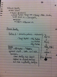
This is the first page of my brief exploration.

Friday, 13 September 2013

Packaging Research

This research page involves confectionery products on store shelves and how they appear.

This is the last page of research for my confectionary genre.

This is page two of the brief specific research.

This is the first page of my confectionary brief research.


Research page 3

Research page 2

Research page 1